packages <- c("dplyr", "sf", "rgbif", "leaflet")
install.packages(packages, dependencies = TRUE)Originally published on GC Digital Initiatives
Why leaflet?
Making a data visualization interactive opens up a host of opportunities for new insights. This is especially true for geographic data. While a static map is preferable for publication in a journal or a book, an interactive map is suitable for exploring data or packing more information in an accessible format. Patterns may emerge when viewing data at different scales or when toggling through features.
There are a number of tools for building interactive maps. Leaflet is one of the most popular open-source JavaScript libraries for creating interactive maps. The leaflet R package is a high-level interface that makes it easy to create beautiful interactive maps in a few lines of code. Using R rather than point-and-click software like ArcMap and others makes your life easier through reproducible code that can be shared for others to recreate your map or that you can return to when you inevitably need to fix something. I use leaflet regularly for data exploration and for sharing preliminary results with collaborators. You can also include leaflet maps in RMarkdown documents, Shiny apps, and even post them to your website!
Goal of the tutorial
The goal of this tutorial is to provide you with a basic understanding of leaflet functionality and the tools and resources to make your own interactive maps. You will:
Read in geographic data for plotting
Plot locations of interest using markers
Color locations according to a factor
Include pop-up text that provides metadata about the locations of interest
Installation
You will need to install four packages for this tutorial. The dplyr package for data manipulation, the sf package for handling spatial data, the rgbif package for acquiring the data, and finally the leaflet package for mapping. All packages are available on CRAN.
Now that the packages are installed, you need to load them into your environment.
library(dplyr)
library(sf)
library(rgbif)
library(leaflet)
Read in and pre-process data
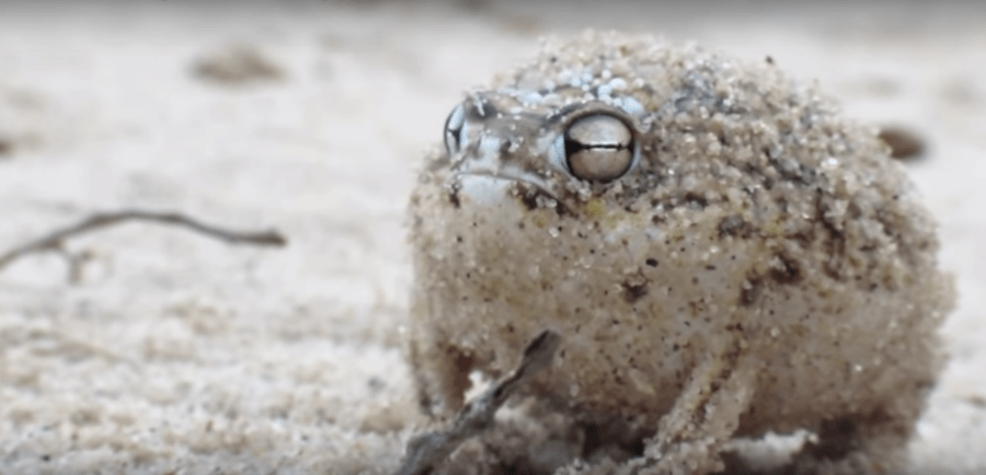
The data you’re going to work with are some locations where rain frogs, genus Breviceps (aka the cute grumpy frog), have been found. Using the rgbif package, you’re querying the large Global Biodiversity Information Repository to obtain the species occurrences. After obtaining the data, some filtering is necessary. First, you’re filtering out observations that do not have latitude or longitude coordinates (hasCoordinate = TRUE) and selecting only the relevant columns for your visualization (select()). Then, you’re converting the data frame that rgbif returns into a simple features (sf) data frame that contains information about which columns to use as coordinates (coords = …) and what the data’s coordinate reference system is (crs = …).
If the %>% bit is confusing, don’t worry- I’ll explain in the next section.
frog_gbif <- occ_search(
  genusKey = 3240854,
  hasCoordinate = TRUE,
  limit = 100
  ) %>%
  .[["data"]] %>%
  select(
    genus,
    species,
    family,
    eventDate,
    decimalLongitude,
    decimalLatitude
    ) %>%
  st_as_sf(
    coords = c("decimalLongitude", "decimalLatitude"),
    crs = "+proj=longlat +ellps=WGS84 +datum=WGS84 +no_defs"
    )
Plot a basic map
Plotting a basic map only takes three lines of code! The necessary steps to make a leaflet map are:
Initialize a map widget using the leaflet() function.
Add layers using the suite of commands the begin with add*(), e.g. addTiles(), which added the OpenStreetMap tiles and addMarkers(), which added our locality data
Print the result. In this case I’m printing the map to the console without assigning it to a variable first.
The %>% (pipe) operator is used to make code easier to read and help the mapmaking process flow organically. It pipes the output of one function into the input of the next. Intuitively, you can think of the following code as “I initialize the map widget and then add the basemap tiles and then add the locality markers.”
leaflet() %>%
  addTiles() %>%  # Add default OpenStreetMap map tiles
  addMarkers(data = frog_gbif)
This is nice and all, but there’s more you can do to make the visualization informative and appealing.
Customization
Now you’re going to add some pizazz to the map. You’re going to color the labels according to the species and add some popup text with information about the family the individual belongs to, its species name, and the date it was collected. In addition, you’re going to use addCircleMarkers instead of addMarkers to use circles instead of flags. Finally, you’re adding a legend so the colors make sense.
Detailed explanations of what each function is doing are provided as code comments.
# First, a color palette needs to be set. We're using the viridis palette, but feel free to explore the options available! I set the domain to NULL because I think it's more flexible to have a general color palette that can be attributed to factors later.
pal <- colorFactor(palette = "viridis", domain = NULL)

# This is the text that will go into the popup labels! The popup argument accepts html input, so I'm using "<br>" to indicate line breaks. I'd recommend printing this to your console so you can see what the popup argument will be parsing.
popup_label <- paste(
  "Family:", frog_gbif$family, "<br>",
  "Species:", frog_gbif$species, "<br>",
  "Date Collected:", frog_gbif$eventDate
  )


leaflet() %>%
  addTiles() %>%
  # You're adding circle markers here. In addition, we're specifying the color and popup labels for the markers. The tilde (~) is telling the color argument to accept the output of the pal object, which is now returning colors mapped to each species. Other plotting software like ggplot don't require a tilde to map to factors or numbers, so this may look foreign, but leaflet does and it just takes a little getting used to.
  addCircleMarkers(data = frog_gbif,
                   color = ~pal(species),
                   popup = popup_label) %>%
  # We're specifying the legend to be in the bottom left of the map. Colors are specified a little differently here. The "pal" argument specifies the palette being used and the "values" argument specifies the values to map to. We're using the tilde here so it knows that you're mapping to a factor.
  addLegend(
    data = frog_gbif,
    "bottomleft",
    pal = pal,
    values = ~species,
    opacity = .9,
    title = "Species"
  )
And there you have it! This is just the tip of the iceberg with what leaflet can do. You can plot polygons, lines, rasters, icons, and more with only a little more code.
Go further
Here are some more resources to learn more about leaflet and general GIS in R.
A more involved tutorial that shows off some more leaflet features.
Geocomputation in R free, online book. It’s a wonderful resource for GIS in R.
Making static maps in R with sf and ggplot2.
Citation
BibTeX citation:
@online{french2019,
  author = {French, Connor},
  title = {Interactively Explore Geographic Data in {R} Using Leaflet},
  date = {2019-11-20},
  url = {https://connor-french.com/posts/2019-11-20-leaflet_tutorial/},
  langid = {en}
}
For attribution, please cite this work as:
French, Connor. 2019. “Interactively Explore Geographic Data in R
Using Leaflet.” November 20, 2019. https://connor-french.com/posts/2019-11-20-leaflet_tutorial/.